
Mike Rodenbaugh
I have a pet peeve with financial media and news reports on the stock market in general. Well, I actually have a lot of pet peeves about the financial media, but this commentary will discuss why one in particular can create issues with expectations vs. reality.
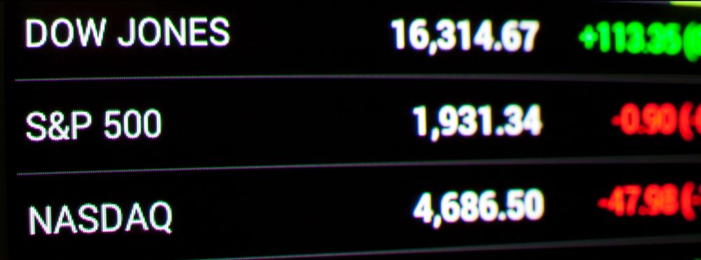
When is the last time you heard a TV news anchor recite the day’s market movement of the MSCI EAFE or the Russell 2000 Value indices? The US financial media generally only reports the returns of three measures of the stock market: the S&P 500, the Nasdaq, and the Dow Jones Industrial Average (“the Dow”). Unfortunately, all of these are slightly different measures of the performance of US large company stocks—only one segment of the diversified portfolio owned by most investors. For a Boardwalk 60% stock, 40% bond portfolio (“60/40”), the information provided by the financial media tells you about the returns of only 11.5% of the portfolio (and 19% of the equity portion of the portfolio).
Why do we only have 19% of the equity allocation in US large company stocks? Perhaps a quick sidebar on diversification would be helpful before we proceed. Investors and advisors divide up investment markets in many different ways: stocks vs. bonds, large vs. small company stocks, “growth” stocks vs. “value” stocks, and developed vs. emerging economy stocks. Beyond stocks and bonds, there are also Real Estate Investment Trusts (REITs), commodities, private equity, and other categories. The reason we categorize these segments of the market—called “asset classes”—differently is because they tend to have different risk and return characteristics and are not highly correlated with each other. If different asset classes have attractive long-term expected returns but “zig and zag” differently, blending them together can provide a smoother “ride” for the portfolio while still producing a solid long-term return.
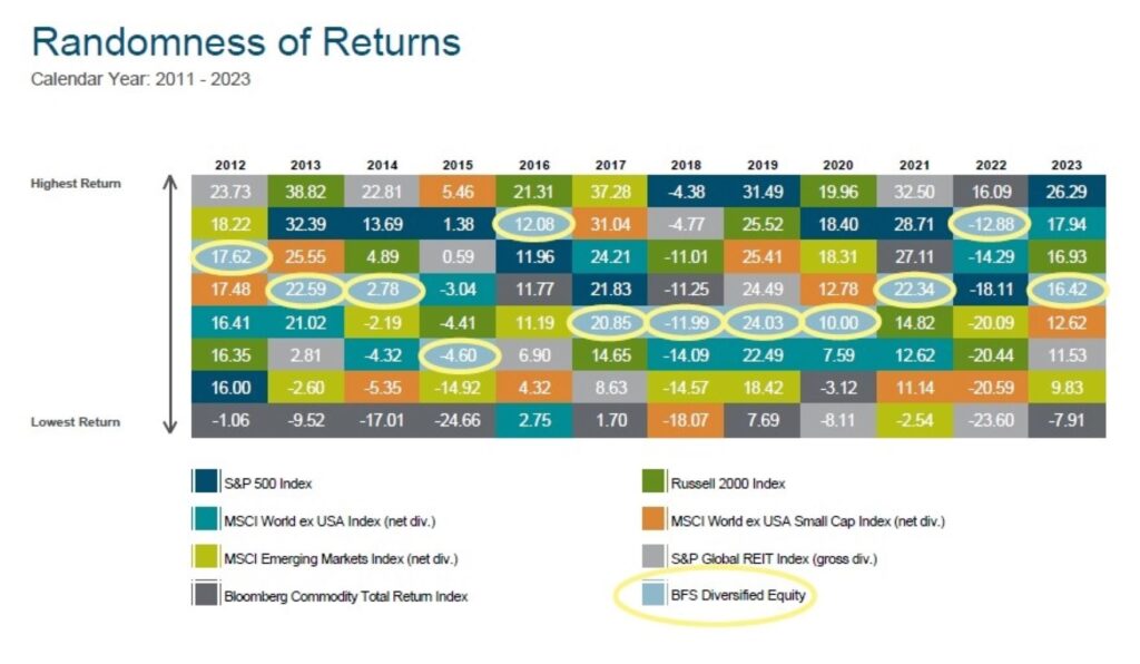
The chart below is a great reminder of why we diversify. It shows the major equity asset classes, each with their own color, and ranks them vertically in each year’s column from best annual return down to worst. The light blue box with red outline is the blended return of a diversified equity-only portfolio that includes all the asset classes shown in the chart. It would be nearly impossible to predict which asset classes would be near the top of the column each year, but you can see that the diversified equity portfolio provides a better-than-average return without requiring any predictions. It’s never the worst performing, but it will never be the best performing either (that’s mathematically impossible).
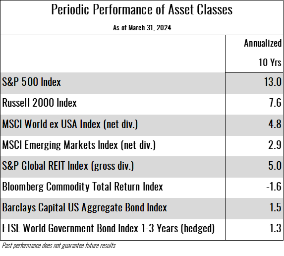
Now back to those media reports. The returns on the S&P 500, the Nasdaq, and the Dow have been remarkable over the last 10 years. So remarkable, in fact, that other segments of global equity markets have not been able to keep up. The chart below shows the annualized returns of various asset classes over the 10 years ended March 31, 2024.
Typically, the best performing asset class rotates more frequently, but when the outperformance of any one asset class is as large and as persistent as the current run for US large company stocks, the diversified portfolio return can lag the top performer significantly. To further pile on: when the outlier asset class is also the most visible (i.e. US large company stocks thanks to the attention provided to them), the urge to “do something about it” can be strong.
Would “doing something” mean loading up on stocks of large US companies? Would it mean loading up on stocks in the “Magnificent Seven” such as Nvidia that have been on a historic run? If that seems risky, you’re right, it is.
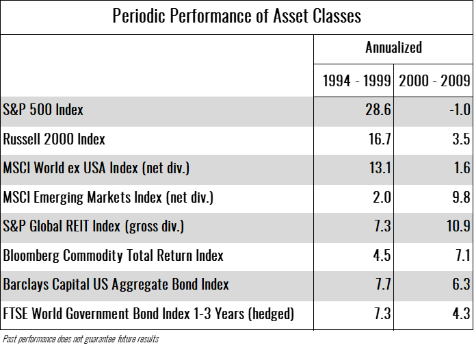
After an asset class dominates performance for a long period of time, it tends to either become overvalued or the other asset classes look very attractively valued relative to the recent top performer. Looking at the last notable period where US large company stocks enjoyed significant outperformance, the returns tend to underperform in the following period. The best recent example of this was the late 1990s when internet and technology stocks were unbeatable during the “dot-com” era. By 2003, the fortunes of those stocks had reversed quickly. Below are the returns of various asset classes for the five years ended 12/31/1999 and those of the subsequent 10 years. While this doesn’t mean the fortunes of these asset classes must immediately reverse, it is certainly more likely than five years ago.
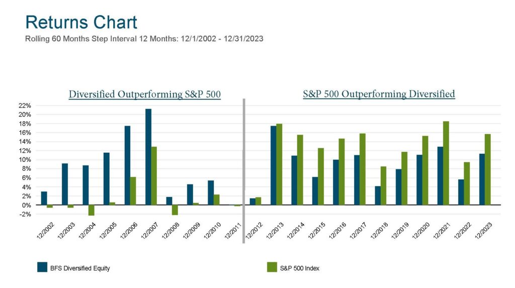
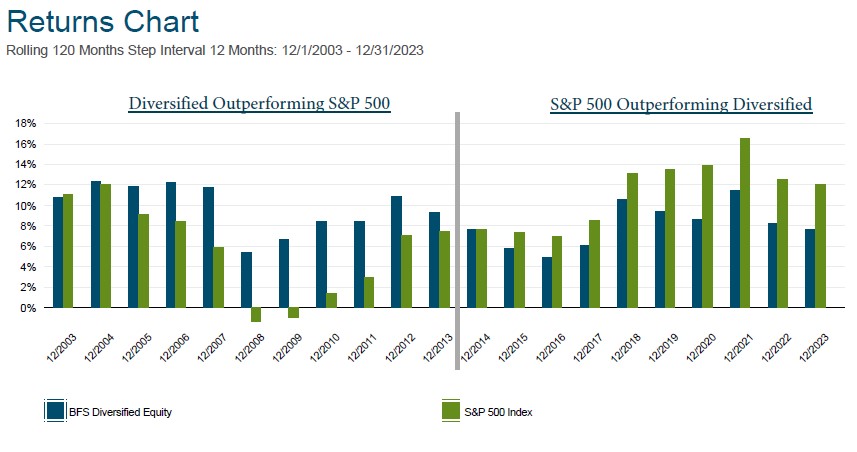
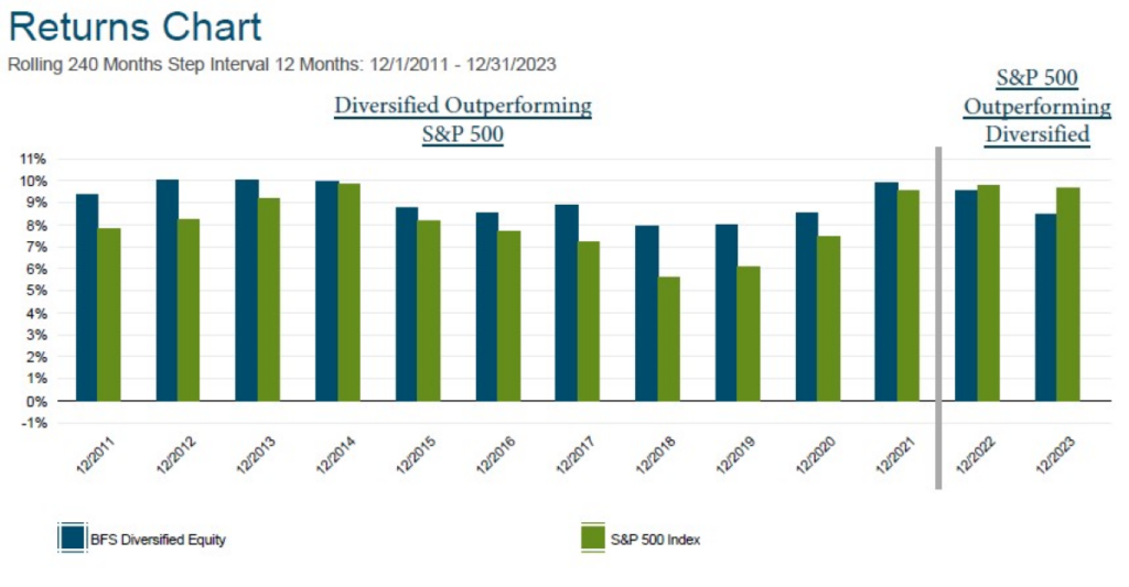
Rolling period returns can be helpful in zooming out and viewing longer periods of time in single data points. In the series of below charts starting with 5-year rolling returns, then 10-year, and finally 20-year rolling returns, you can see how acute the S&P 500 outperformance can be over 5-year periods, but as you lengthen the time period to 20 years, it’s only the two most recent 20 year observation where the S&P 500slightly outperforms the diversified portfolio (and only after the staggering 10-year outperformance of other asset classes seen in the chart above.
5-Year Rolling Chart
10-Year Rolling Chart
20-Year Rolling Chart
Should investors have been able to predict this strong period of US large company outperformance or recognize the trend early and add exposure? So called “tactical asset allocation funds” have the flexibility to adjust their mix of asset classes based on their forecasts. If there was a clear signal that one should have bet heavily on US stocks, those funds would have done it. They didn’t. Instead, they have failed miserably relative to a fixed (non-tactical) asset allocation, as pointed out by Morningstar in articles over the last few years (here and here).
We believe that the equity portion of our clients’ diversified portfolios will be competitive with the S&P 500 over their investment time horizons, but there will most certainly be periods of time when a specific asset class leads the pack and outperforms a diversified equity portfolio over a multi-year period. This does not mean that diversification is broken. In those moments, it may be helpful to keep in mind one of my favorite maxims regarding portfolio management: “A portfolio is like a bar of soap. The more you handle it, the less of it you have.”